What are people willing to pay?
Is our product too expensive? In a recent survey, a quarter of our customers said they hesitated to buy because of the price. How do we figure out what price would maximize sales?
Van Westerndorp Analysis
Price is one of the 4 P's of Marketing, yet many Marketers don't know how to optimize pricing...More


There's certainly a lot of excitement about the results of the survey.
Pricing isn't an easy fix, but it's always a good thing to identify a way to improve.
I've talked to the CEO, and I'm recommending we run another survey.
This time focused on pricing.
I have some experience with Van Westendorp pricing analysis – it was very insightful at my last company.
I'm afraid that I don't actually know the details of how to run one, we outsourced it at the time.
Could you do some research and figure it out?
She wants the survey sent out by the end of the week.
This course is a work of fiction. Unless otherwise indicated, all the names, characters, businesses, data, places, events and incidents in this course are either the product of the author's imagination or used in a fictitious manner. Any resemblance to actual persons, living or dead, or actual events is purely coincidental.
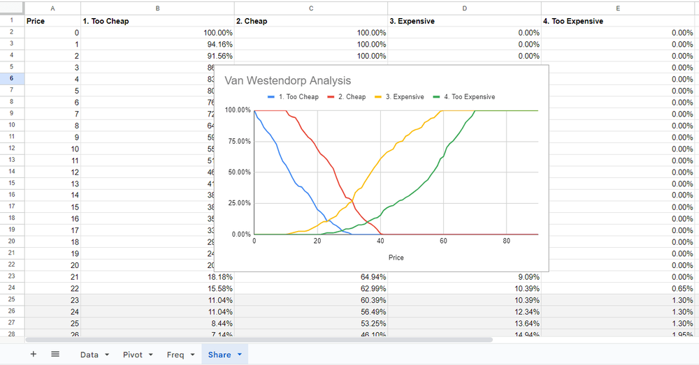
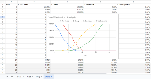
The Van Westendorp Price Sensitivity Meter (PSM) is a widely used pricing technique which uses survey data to determine the willingness to pay of your potential consumers. By asking a series of four questions, it's possible to determine where consumer demand starts to drop off because too many people perceive the price as too expensive or too cheap (i.e. too good to be true, or a sign of quality issues). The questions are:
1. At what price would you consider the product to be priced so low that you would feel the quality couldn’t be very good?
2. At what price would you consider the product to be a bargain—a great buy for the money?
3. At what price would you consider the product starting to get expensive, so that it is not out of the question, but you would have to give some thought to buying it?
4. At what price would you consider the product to be so expensive that you would not consider buying it?
By asking this series of questions you're able to derive the customer's willingness to pay indirectly, rather than specifically asking "how much are you willing to pay?" (a question they might not know how to answer).
As a result of the analysis you're able to determine a range of acceptable prices, including the Optimum Price Point (OPP) where an equal number of people see the price as too cheap or too expensive, and the Indifference Price Point (IDP) where an equal number of people see the product as cheap or expensive (usually slightly higher). Van Westendorp is commonly used by Marketers because it's simple to execute, asks questions that are easy for respondents to answer, and is relatively easy to understand.
Complete all of the exercises first to receive your certificate!
Share This Course